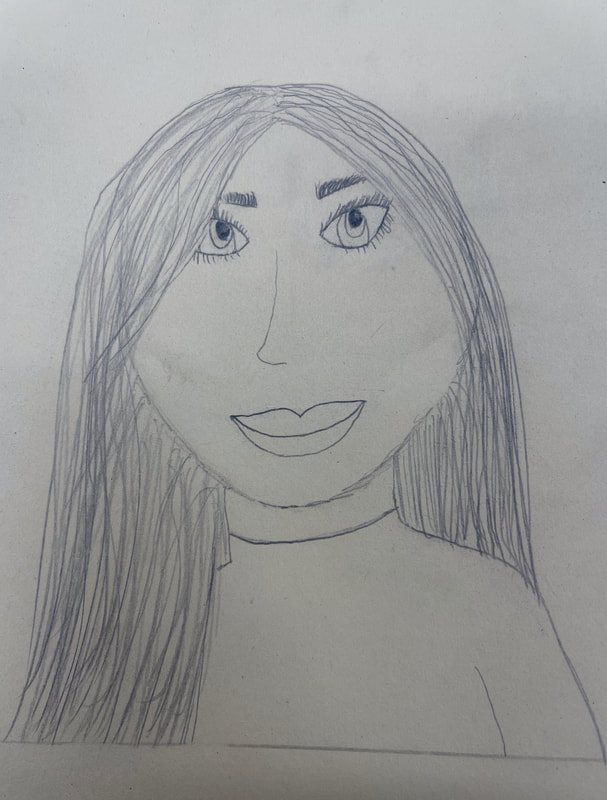
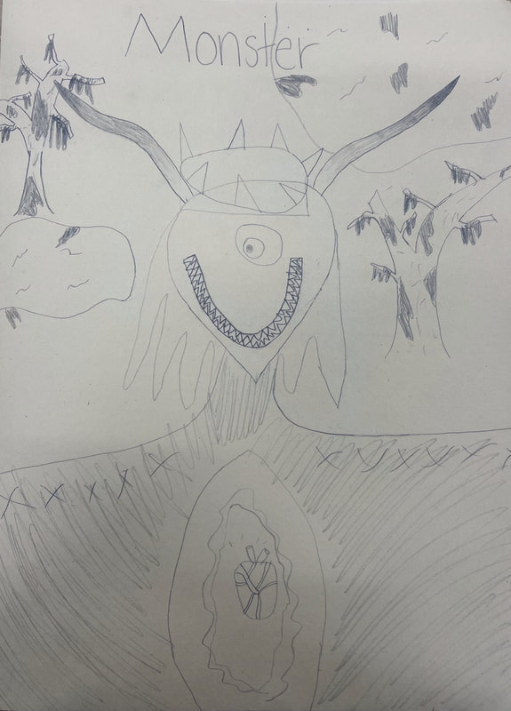
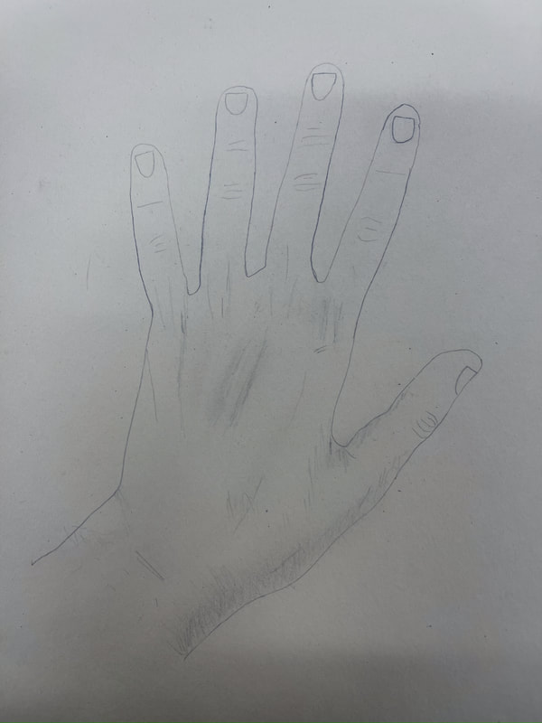
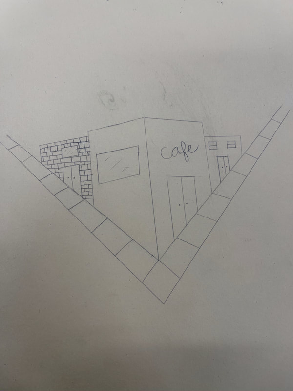
Assessment Drawings
Cut Paper Composition
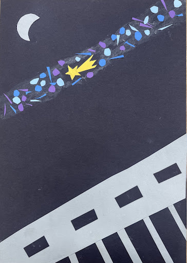
We used construction paper with different colors to create a cut paper composition and I made a night scene with a train going by as well as a shooting star surrounded by different colored lights.
9 Compositional Photos
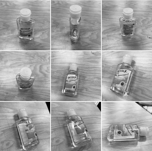
We took 9 compositional photos of an everyday object at different angles and positions to try and pick the composition we thought best. I chose hand sanitizer because of covid and made it black and white to show the light reflecting off it better.
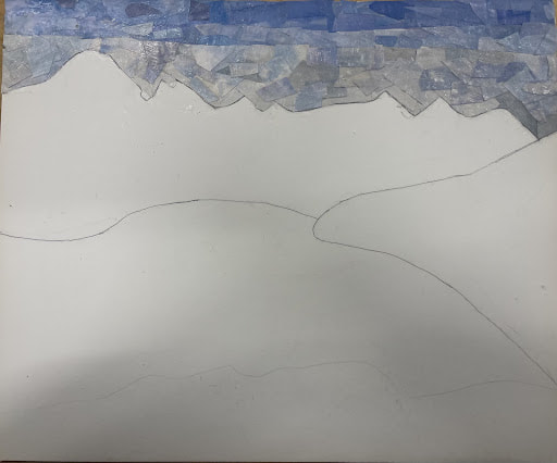
Color Sketch
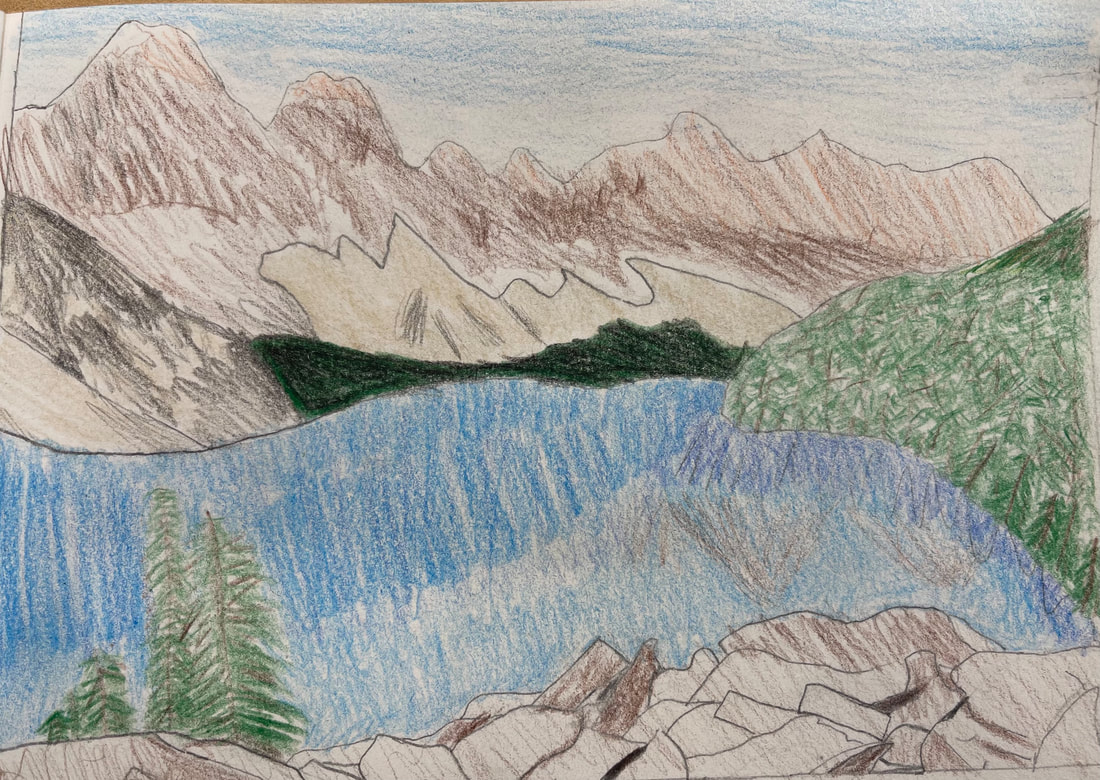
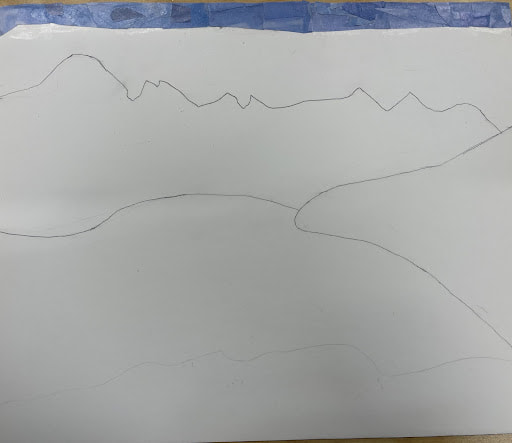
This is my color sketch of a photo from Banff National Park, Canada. I will base my colors and placement for my collage off this sketch that I made. This was apart of the planning process for thet collage.
Collage Project
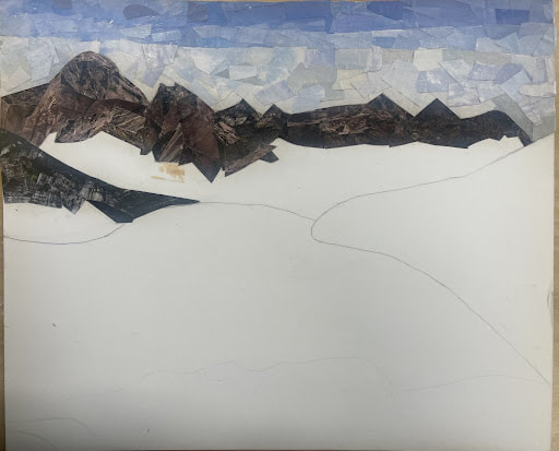
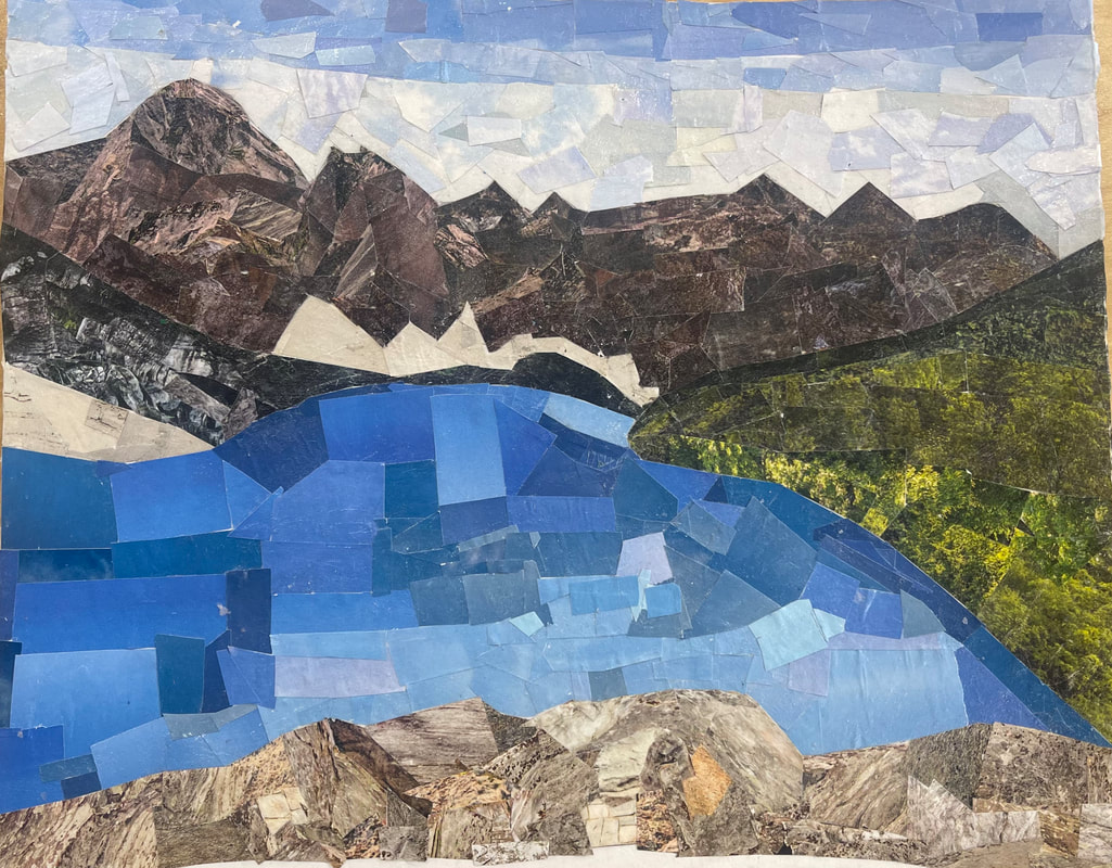
- This is a collage I made of the Banff National Park in Canada. I used pieces from magazines to make up this image. I used different shades of each element on this piece to create more dimension and try yo make it look more realistic. The pieces i used had sharper edges as i used scissors to cut them. I started with the background and worked my way to the forward pieces of the image to add perspective. For the mountains I used different images of rocks and such so that they looked more 3D. For the water i made it a gradient to reflect where the sun is shining. I did the rocks last because they are towards the front of the picture.
- Overall I think my piece turned out well. I like how the mountains look with the different types of rock i used. I'm glad I used smaller pieces for the sky because it makes the gradient from light to dark more smooth. I'm also glad i worked from the back to the front so the piece is more coherent. I do however wish that the trees had more dimension to them. I wish I would have used pictures with bigger sized trees towards the front to add more perspective. I like the water but I wish I would have used a more green blue rather than the more cool toned one i used.
- I wanted the art to look somewhat ethereal. In the initial photo I thought the location was one of the most beautiful places ever with mountains and trees and water surrounding it. I wanted the colors to be vibrant as to show the brightness and beauty of the place. I do think that the piece does reflect this meaning for the most part. I tried to keep the colors as close to the original picture and reflect the true artistry of the scene.
- Overall Im proud of the piece i made and i like it. I spent a lot of time on making it and i truly think i did my best. I think it captures what I was going for and the beauty that is banff national park. I'm not very good at art at all so this is something that im proud of myself for making. I put in a lot of effort into every aspect and making sure there was no white space or blank space. Overall i'm happy with the end result of this collage.
Pen Unit
Pen and Ink Value Chart
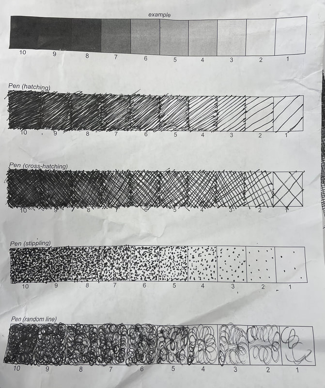
I watched the video tutorial on how to do the value chart for this and completed my own using the same techniques listed in the video.
Pen and Ink Video
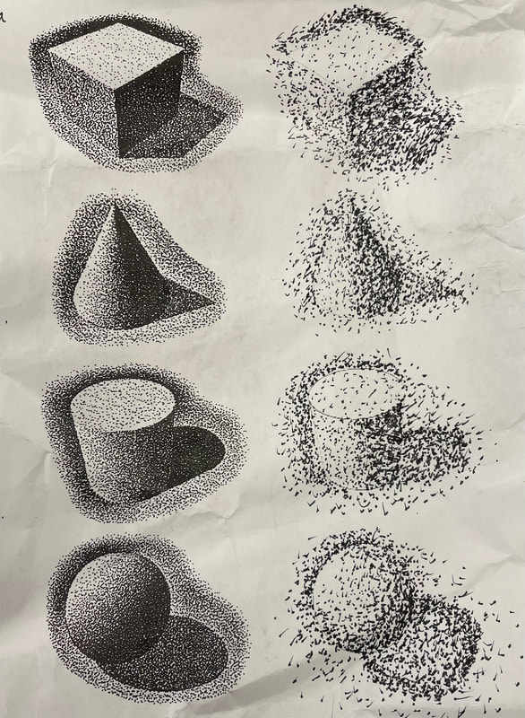
For this worksheet I worked on my stippling technique for these 3 shapes by copying the image next to it.
Pen Tutorial Drawings
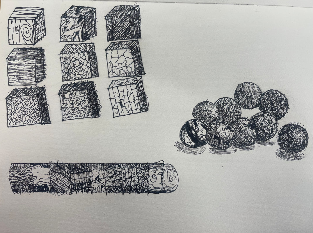
For this assignment I watched 3 separate videos and recreated the drawing shown to improve my pen and shading skills using different techniques.
1 Point Perspective
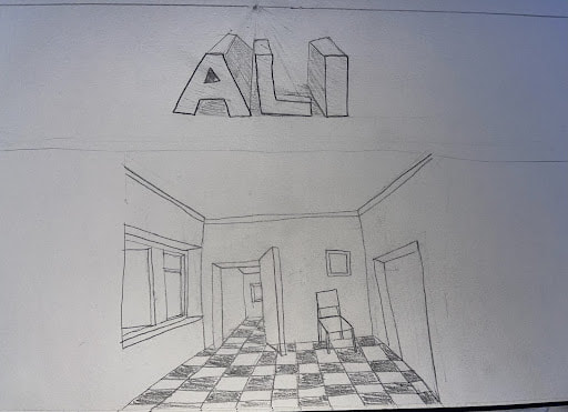
For this assignment I used one point perspective to create these two drawings and followed the video tutorial. I learned more about perspective and how to use the vanishing point.
2 Point Perspective
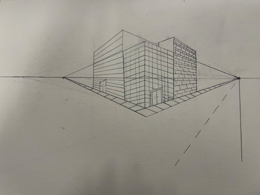
In this assignment I followed the video to make this drawing in 2 point perspective and furthered my understanding of 2 point perspective.
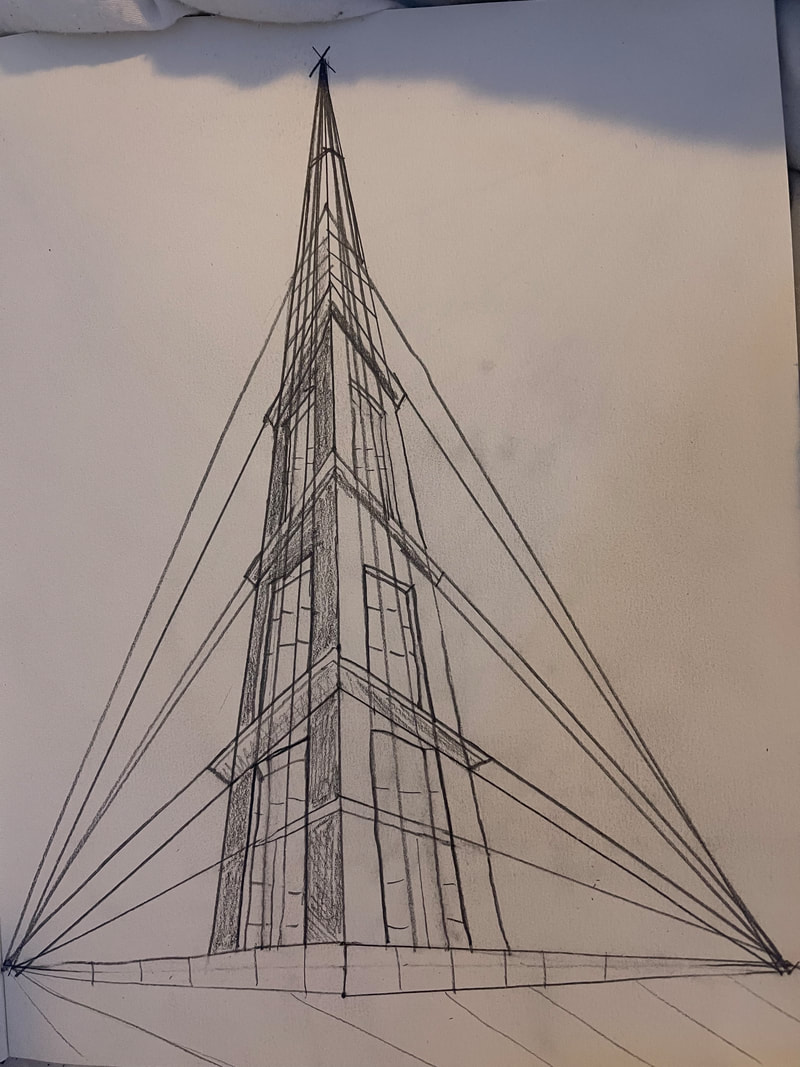
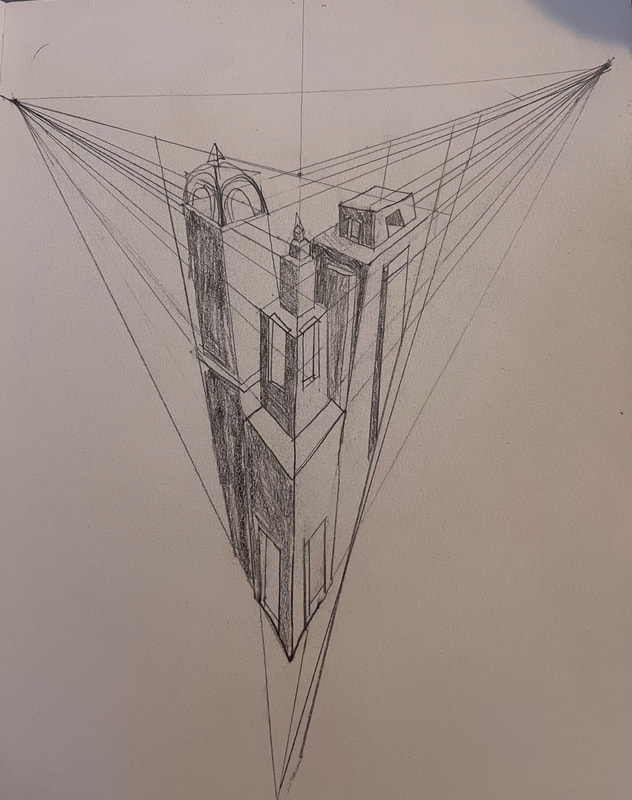
3 Point Perspective
|
|
In this assignment I watched the two videos and practiced 3 point perspective and made my skills better in it.
Colored Pencil Forms
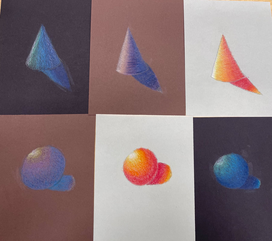
For this assignment we had to do 2 drawings, a cone and sphere, on 3 different colors of paper and color them with prisma colors to practice our gradient and blending skills.
Colored Pencil Fruit
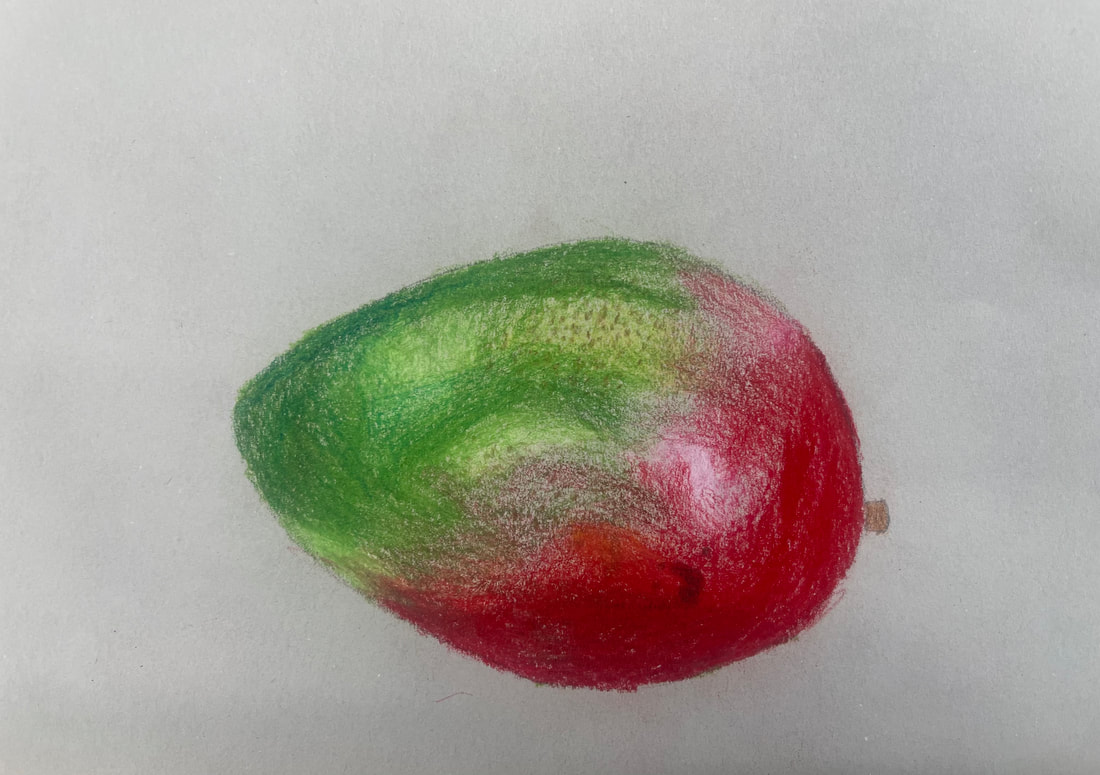
For this assignment I chose to draw a mango and follow an image i found. I bettered my skills in gradient and blending using prisma colors.
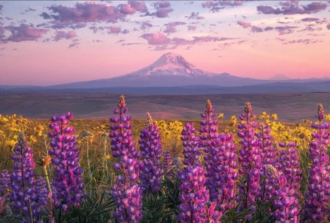
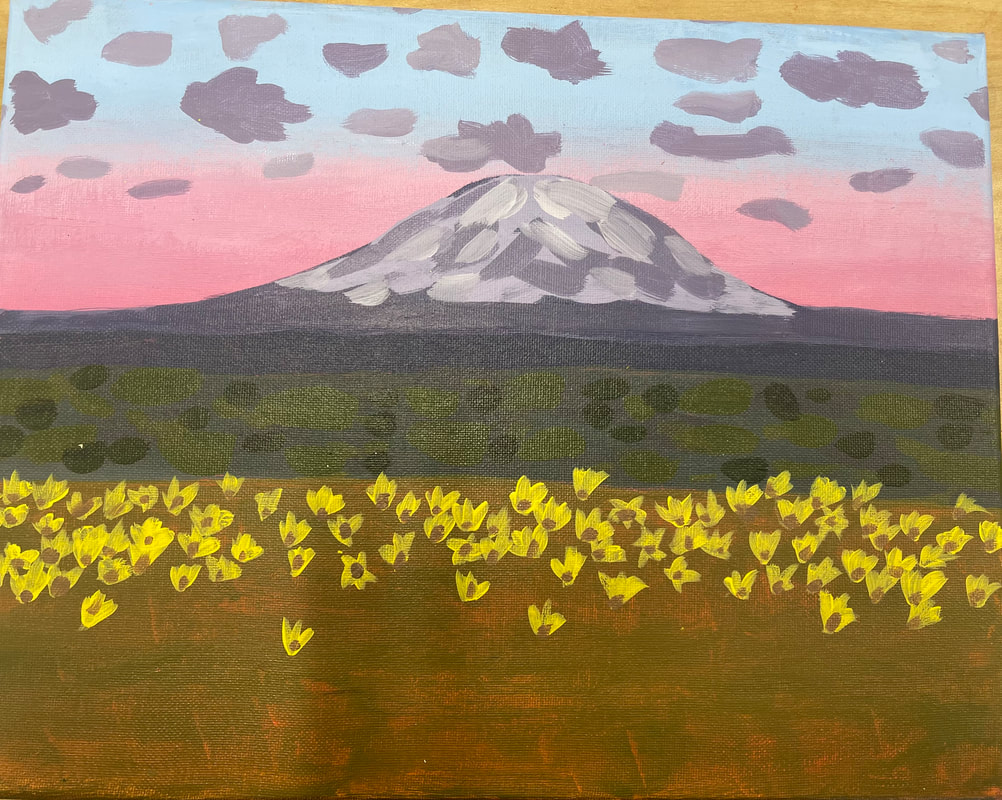
Landscape in Style of a Famous Artist Final Painting
Absent for brainstorming ideas and final color sketch
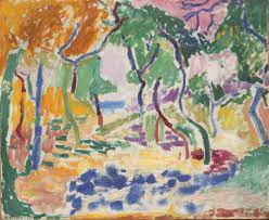
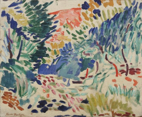
Henri Matisse:
- His art style is called Fauvism
- Often regarded as the most important French painter of the 20th century
- His art was bright, pure color and expressive form and composition
- He used vibrant and dramatic colors
- He fundamentally altered the course of modern art and affected the art of several generations of younger painters
- The years 1917–30 are known as his early Nice period, when his principal subject remained the female figure or an odalisque dressed in oriental costume
- born on December 31, 1869, and was raised in France
- A visit to Saint-Tropez in southern France inspired him to paint bright, light-dappled canvases
- Born the son of a middle-class family, he studied and began to practice law but after a health scare he went to Paris to study art formally
- He uses pure colors and the white of exposed canvas to create a light-filled atmosphere
- He used white paper and gouache
- A pair of scissors was the tool he used to transform paint and paper into plants, animals, figures, and shapes.

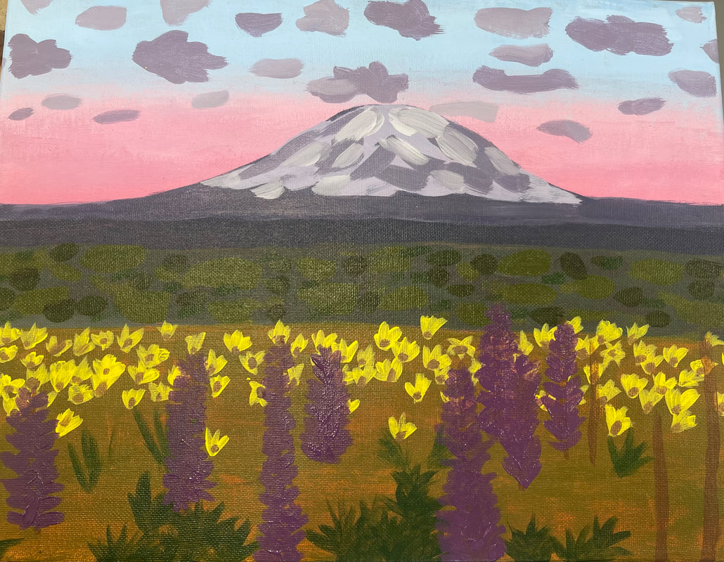
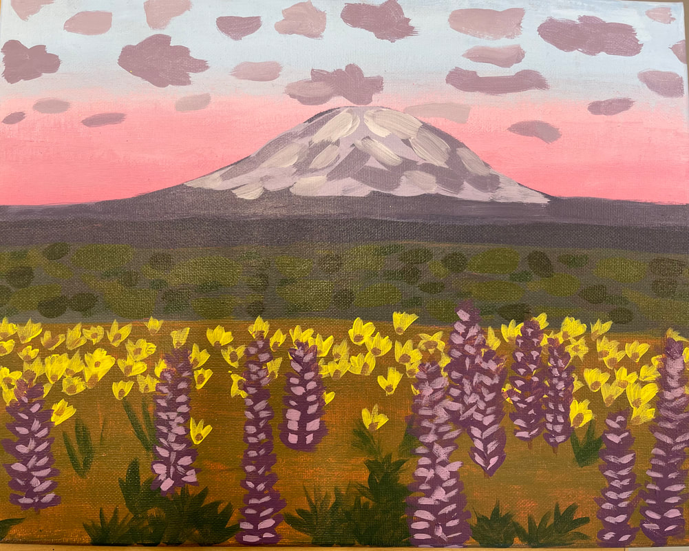
1. Name: Henri Matisse
- Incorporate brighter and pure colors
- Used expressive form
- Layering instead of blending
- Utilized the fauvism art style
2. The craftsmanship of my painting is not super neat or detailed as Henri Matisse's art was. Its more basic with different colors layered on top on one another. All the brush marks are prominent and all the elements in the piece are separated but cohesive.
3. The most difficult part of this painting was not being able to blend much and layering to give a similar effect.
4. I incorporated brighter colors on top of the natural scheme of nature like Henri did in his painting where he used more vibrant shades. I also use pure colors with no variation in them to layer like he did.
5. The style of this piece with the layering, brushwork and less detail all are referenced from matisse's style of art.
6. I'm not the best artist so I don't think Henri would be overly impressed by my painting but I think he would feel proud of his influence and how other people are getting inspired by hs work.
7. If i were to do this project again I would probably add even more brighter colors and use brighter paints to really resemble his work more.
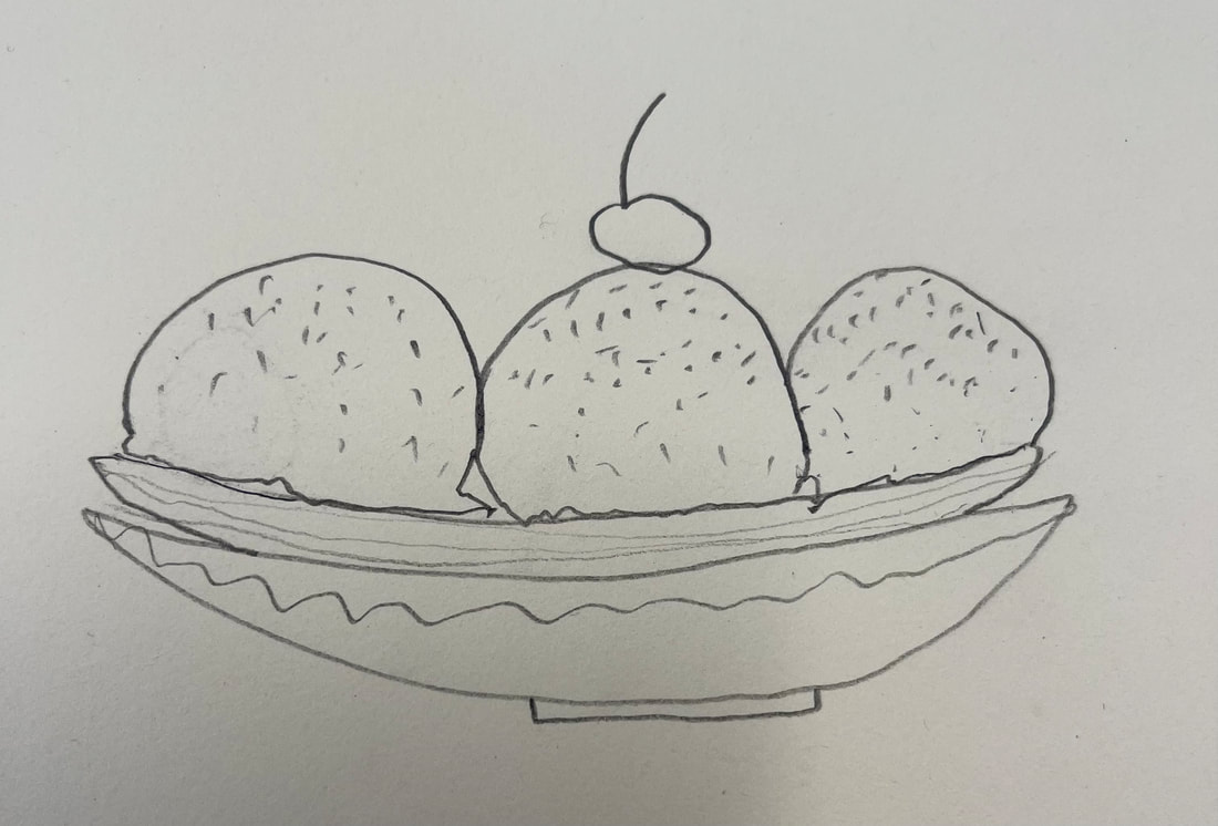
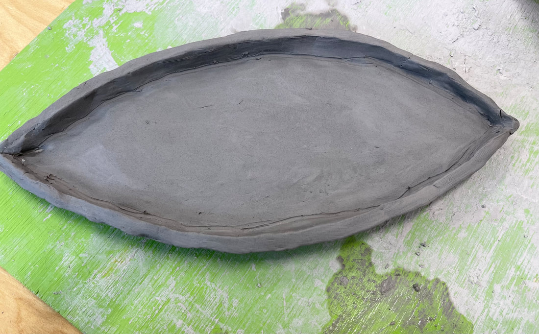
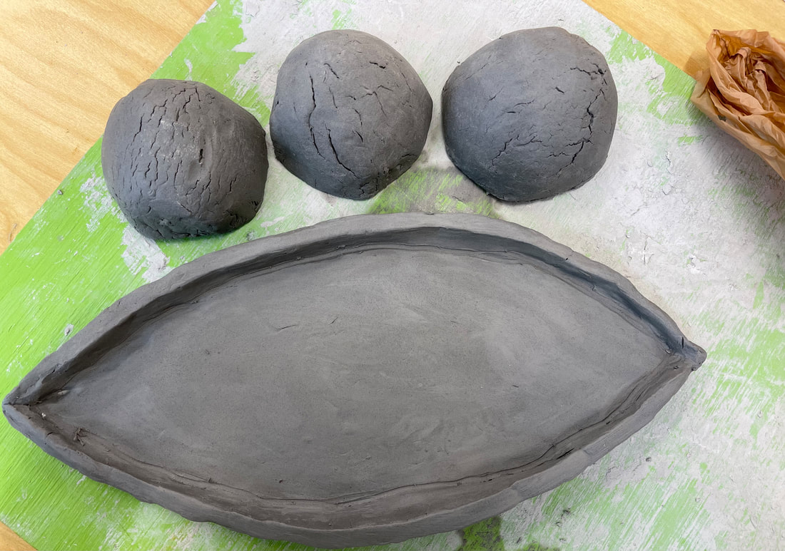
Clay Food Sculpture
Absent for color sketch
Pop Art Research:
Definition: art based on modern popular culture and the mass media, especially as a critical or ironic comment on traditional fine art values.
Andy Warhol:
Keith Haring:
I chose these artists because i thought that they where some of the most iconic when it comes to pop art. I also recognized a lot of there work so I wanted to learn more.
Definition: art based on modern popular culture and the mass media, especially as a critical or ironic comment on traditional fine art values.
Andy Warhol:
- His parents were artists
- He was classically trained
- He produced over 10000 works in his entire life
- He was one of the most influential pop artists
- He was born in NYC
- He played in a jazz band
Keith Haring:
- Experimented with many mediums
- Did subway drawings
- Arrested for vandalism
I chose these artists because i thought that they where some of the most iconic when it comes to pop art. I also recognized a lot of there work so I wanted to learn more.
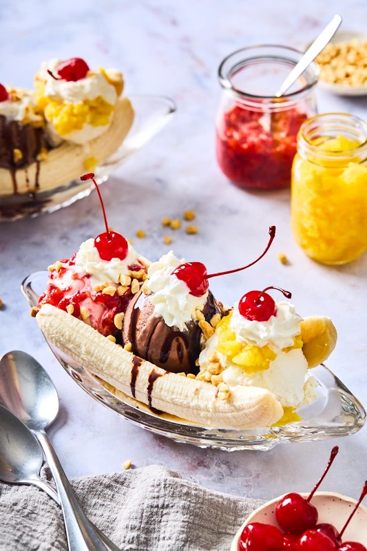
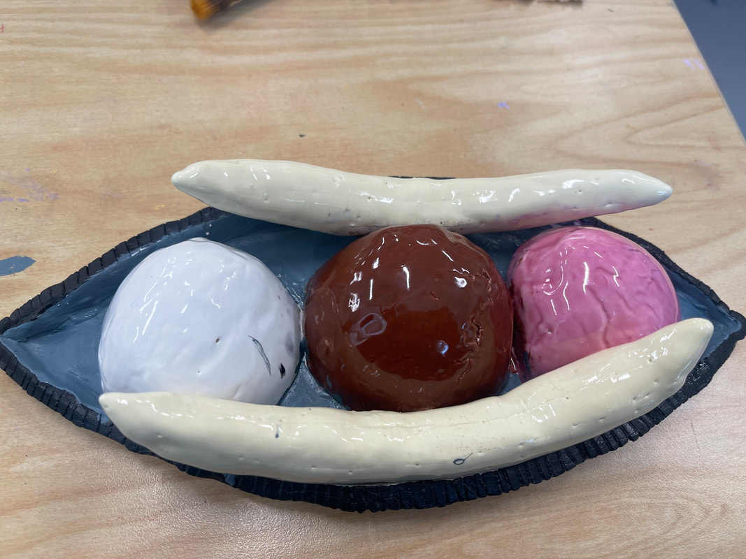
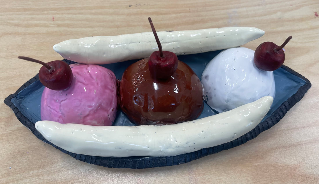
1. The craftsmanship of my banana split is not the neatest but i tried my best to make it as realistic as possible by using glaze on the ice cream and acrylic paint on the bowl and cherries.
2. The most difficult part of this project was trying to paint around the already glued in objects without getting paint on all of the other element s of the sculpture.
3. To construct this piece I used lots of different techniques like I let the ice cream dry and crack so it had the texture of scooped ice cream and I used the different tools to get the right shapes like the pin wheel for the bowl,
4. I liked the color choices I picked and I think they worked out good. The glaze showed up the right color in the end which i'm happy about and I painted the bowl black and gray to make it look a little more sophisticated,
5. I think my sculpture is interesting from all views because its handmade and every angle has its own unique quirks to it.
6. The differences between this sculpture and something 2D is the manual effort to make all of the shapes and details on this physical piece rather than just drawing them out on paper is a lot more work.
7. To create the texture on the ice cream I let it dry out a bit so it would get cracked and look like scooped ice cream. I also used sharp tools for the lines on the bowl and banana.
8. I think my sculpture does look like the original food because I used glaze on the ice cream to give it a similar look and acrylic paint on the bowl and cherries to make them look real as well as the textures added.
9. The research of pop artists influenced my piece by making me want to add more colors and textures to my sculpture.
10. If i were to do this again I would wait to stick all of the elements together until after I painted them so it looks more clean and the paint doesn't get in places its not supposed to.
Final Reflection
I’ve never really liked art or been good at it. I always tried my best and I appreciated a class with a lot of direction to help guide me and make me a better artist. I do wish there was more interactive things because the silent classroom setting was not my favorite. I’ve grown to like this class more as time has gone on but I don’t think I’ll ever be an actual artist. I learned a lot about collage, painting, clay and much more. I appreciate art more and what goes into it as well. I think this is a good class for those looking to pursue art but I don’t think it was the perfect fit for me. But thank you Ms. Rossi for helping me and answering all of my questions. I appreciated this time in your class.
